11 laws and principles to use in design
Design elements, laws and principles, garnered over centuries of observation, describe fundamental ideas about the practice of good visual design that are assumed to be the basis of all intentional visual design strategies. These elements form the ‘vocabulary’ of the design, while the laws and principles constitute the broader structural aspects of its composition.
David Hume described these as “the constant and universal principles of human nature.” Awareness of the elements, laws and principles in design is the first step in creating successful visual compositions.
While these universal design elements, laws and principles may not always be absolutes, understanding them can help you achieve success in a multitude of fields including graphic, industrial design and experience design, architecture and fine art.
Products designed with appreciation for these natural principles will tend to be better received and more easily utilised by the general public. But what are some of these elements, laws and principles? Below is a list of 11 to whet your appetite.
Occam’s RazorPermalink to section titled Occam’s Razor
Occam’s razor (also spelled Ockham’s razor) states that the explanation of any phenomenon should make as few assumptions as possible. The principle is often expressed in Latin as the lex parsimoniae (law of succinctness): all things being equal, the simplest solution tends to be the best one. One consequence of this methodology is the idea that the simplest or most obvious explanation of several competing ones is the one that should be preferred until it is proven wrong.
But how does this relate to design? 37Signals’ book Getting Real provides a good overview: deliver just what customers need and eliminate anything they don’t. Start with the interface, the real screens that people are going to use. Begin with what the customer actually experiences and builds backwards from there. This lets you get the interface right before you get the software wrong. It’s about keeping things simple, iterating the design and lowering the cost of change; it is about launching, tweaking and constantly improving.
Hick’s LawPermalink to section titled Hick’s Law
Hick’s Law, or the Hick–Hyman Law, describes the time it takes for a person to make a decision as a result of the possible choices he or she has. The Hick’s Law assesses cognitive information capacity in choice reaction experiments. The amount of time taken to process a certain amount of bits in the Hick’s Law is known as the rate of gain of information.
This law has implications in areas such as website navigation and getting people to take action. Since the time it takes to make a decision increases as the number of alternatives increases, the more options you offer, the less likely any one of those options will be taken.
Hick’s Law can be visualised with the following image:
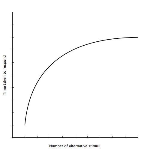
Figure 1: Hick’s Law
The conclusion from Hick’s law is to provide less options or present only those options that are necessary or required to complete the given task. Instead of a long list of menu options, think about how you can group them into as few high level choices as possible. Present those few options in common places like navigation and only present more options as someone digs deeper into one level of categorisation. 6 – 8 main navigational links is a general guide.
Fitts’ LawPermalink to section titled Fitts’ Law
Fitts’ Law is a model of human movement in human–computer interaction and ergonomics, which states that the speed and accuracy with which a user can select an on-screen object depends on the size of the object and how far the user has to move the pointer. Fitts’ Law is used to model the act of pointing, either by physically touching an object with a hand or finger, or virtually, by pointing to an object on a computer monitor using a pointing device.
Fitts’ Law can be visualised with the following image:
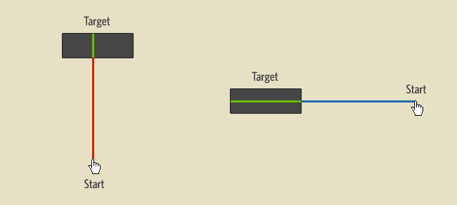
Figure 2: Fitts’ Law
Fitts’ Law has implications for designers: features that require user interaction (e.g., links and buttons) should be as large as practically possible given display constraints and that frequently used features should be grouped near one another to minimise the distance that the user has to move the cursor to activate them.
Gestalt psychology is a theory of mind and brain positing that the operational principle of the brain is holistic, parallel, and analogue, with self-organising tendencies.
The Gestalt effect is the form-generating capability of our senses, particularly with respect to the visual recognition of figures and whole forms instead of just a collection of simple lines and curves.
The key principles of Gestalt systems are emergence, reification, multi-stability and invariance.
- Emergence – the process of complex pattern formation from simpler rules.
- Reification – the constructive or generative aspect of perception, by which the experienced percept contains more explicit spatial information than the sensory stimulus on which it is based.
- Multi-stability – the tendency of ambiguous perceptual experiences to pop back and forth unstably between two or more alternative interpretations.
- Invariance – the property of perception whereby simple geometrical objects are recognised independent of rotation, translation, and scale; as well as several other variations such as elastic deformations, different lighting, and different component features.
Prägnanz is the fundamental principle of perceptual segregation proposed by Gestalt psychologists. It states that during visual perception, the best, simplest and most stable shape of any possibilities will be perceived.
Prägnanz is defined by six laws:
- Law of Closure – the mind may experience elements it does not perceive through sensation, in order to complete a regular figure (that is, to increase regularity).
- Law of Similarity – the mind groups similar elements into collective entities or totalities. These similarities may depend upon relationships of form, colour, size or brightness.
- Law of Proximity – spatial or temporal grouping of elements may induce the mind to perceive a collective or totality.
- Law of Symmetry (figure ground relationships) – symmetrical images are perceived collectively, even in spite of distance.
- Law of Continuity – the mind continues visual, auditory and kinetic patterns.
- Law of Common Fate – elements with the same moving direction are perceived as a collective or unit.
These laws can and should be used in user interface design. The laws of similarity and proximity can, for example, be used as guides for placing radio buttons.
Miller’s LawPermalink to section titled Miller’s Law
Miller’s Law is based upon theories of communication. The law instructs us to suspend judgment about what someone is saying so we can first understand them without imbuing their message with our own personal interpretations.
The Magical Number 7 ± 2Permalink to section titled The Magical Number 7 ± 2
This law, also known as Miller’s Law, argues that the number of objects, or chunks, an average human can hold in working memory is 7±2. Later research on short-term memory and working memory revealed that memory span is not a constant even when measured in terms of a number of chunks. The number of chunks a human can recall immediately after presentation depends on the category of chunks used (e.g., memory span is around seven for digits, around six for letters, and around five for words), and even on features of the chunks within a category. For instance, memory span is lower for long words than it is for short words. In general, memory span for verbal contents (digits, letters, words, etc.) strongly depends on the time it takes to speak the contents aloud.
Fibonacci SequencePermalink to section titled Fibonacci Sequence
The Fibonacci Sequence is a list of numbers is created by repeatedly adding the sums of the last two digits. It begins with 0, 1, 1, 2, 3, 5, 8, 13, 21, 34, 55, 89, 144 and so on. What is fascinating is that this sequence appears repeatedly in nature, in tree branches, leaves on stems, in a wide variety of plants and the reproduction pattern of honeybees.
The Fibonacci Sequence is often visualised in design with the following diagram:
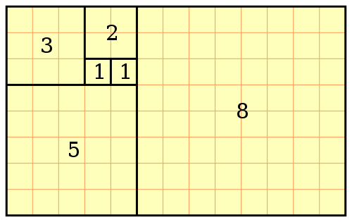
Figure 3: Fibonacci blocks
The Fibonacci Sequence is closely related to the Golden Ratio.
Golden RatioPermalink to section titled Golden Ratio
The Golden Ratio is a term used in both mathematics and art. Two quantities are said to be in the golden ratio if the ratio of the sum of the quantities to the larger quantity is equal to the ratio of the larger quantity to the smaller one. The golden ratio is an irrational mathematical constant, approximately 1.6180339887. Other names frequently used for the golden ratio are the golden section and the golden mean.
The following figure can be used to express the geometric relationship that defines the constant:

Figure 4: Golden Ratio
The Golden Ratio describes the most aesthetically pleasing proportionate shapes and designs. A Fibonacci spiral, created by drawing circular arcs connecting the opposite corners of squares in the Fibonacci tiling (this one uses squares of sizes 1, 1, 2, 3, 5, 8, 13, 21, and 34), can be used to plan your design.

Figure 5: Fibonacci spiral
As a designer, you can use this ratio to place the elements on your pages to create mini golden ratio rectangles, which will be pleasing to the eye. It can be used for captions, text flowing beside images, advertising space and navigation buttons and menus. It is worth bearing this ratio in mind when creating rectangles for your pages.
You can read more about the Golden Ratio on the Smashing Magazine website.
Rule of ThirdsPermalink to section titled Rule of Thirds
The Rule of Thirds is a compositional rule of thumb in visual arts such as painting, photography and design. The rule states that an image should be imagined as divided into nine equal parts by two equally-spaced horizontal lines and two equally-spaced vertical lines, and that important compositional elements should be placed along these lines or the four intersections. Proponents of the technique claim that aligning a subject with these points creates more tension, energy and interest in the composition than simply centring the subject would.
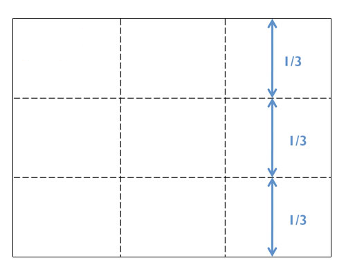
Figure 6: Rule of thirds
In most cases it is neither possible nor useful to use all four points to highlight the most important functions or navigation options in a design. However, you can use some of them (usually one or two) to properly place the most important message or functionality of the site. The left upper corner is usually the strongest one, since users scan web-sites according to the F-shape.
You can read more about the Rule of Thirds on the Smashing Magazine website.
Pareto PrinciplePermalink to section titled Pareto Principle
The Pareto Principle, also known as the “80-20 rule” and the “Law of the Vital Few”, states that, for many events, roughly 80% of the effects come from 20% of the causes.
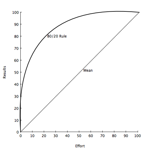
Figure 7: The Pareto Principle (80/20 rule)
Use the 80-20 rule to focus your resources in order to realise greater results. Identify what 20 percent of a products features are used 80 percent of the time and concentrate design and testing efforts on those resources. Or identify what critical 20 percent of a product’s features are responsible for 80 percent of the revenue and concentrate on that.
The 80-20 rule can help you decide what to redesign, what parts of a product or your time to downplay, what to throw away, or where to invest your scarce resources. It can help you resist efforts to correct and optimise designs beyond the critical 20 percent as more would yield diminishing returns.
Updated on: 10 February 2021